Hello moderator I am Luke Seddon together we will be embarking on my media journey; I have clearly labelled all of my evaluation questions, Final Music video, Digipak, Magazine Advert, with all of my drafts along wih research and planning.
In total I have 93 Posts and 85 are research and planning.
Friday 12 February 2016
Thursday 11 February 2016
Q1 - In what ways does your media product use, develop or challenge forms and conventions of real media products?
Directors Cut A2 Music Video- Sandi Thom Punk Rocker Script
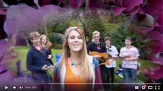
Emily: We used two overlaying shots, one of Indya in the background to introduce the star in a long shot with grungy font added over the top to portray the title of the song and to give it a grungy effect.
Luke: We went against convention by using a blur and we used natural framing through the use of an archway in the background. We used a medium shot of her singing into camera and ken burnsed it into a close up to show her singing.
Emily: We used another blur to fade in between the shots due to the slow rhythm, Indya is right of frame. We also made this shot use motion in the way Indya is swinging in the hammock, and the hammock also brought bright colors into the shot to add to the punk genre.
Luke: We then used a right of frame shot of Indya singing into camera. We used a natural background to connote Indya's natural beauty. We also made Indya wear white clothing as it created the effect of purity.
Emily: This shot ends with an overlaying fade of the next shot which is a pull focus where the focus starts on the hedge whilst an all-black effect is overlaid. Then the camera focus goes onto our star.
Luke: The next shot enters with another blur. The shot itself is a close up of a guitar, it over cranks and Ken Burns.
Emily: We then used a flying cam over the guitar with the guitar in centre frame.
Luke: The next shot is under cranking of the motorway. The saturation has been upped for the lyric “Not everybody drove a car” and then the next shot is a flip footage from the other side of the motorway, just to break up the two shots.
Emily: The next shot pans from left to right, it’s a wide shot which shows our star in the middle but she is not looking into camera, we used this with the sepia tone to adhere to the idea of the memories within the video.
Luke: The next shot is a low angle shot. Robbie comes in from the right, gives the impression of power as the camera is adjusted below along with the posh car.
Emily: The scene then cuts to create continuity editing of Robbie walking straight across the front of the camera in front of the car. It gives a perspective of the size of the car and shows of Robbie’s suit connoting wealth.
Luke: The next shot then cuts to a close up, over the shoulder shot of Robbie on the phone, it gives the idea of technology and the idea of technology taking over.
Emily: We then cut to a shot of Indya in punky makeup with dark lipstick, we also used dark ambiotic lighting to connote the idea of the punk genre. This is a medium close up of Indya and shows her also putting in her headphones to link with the previous shot and to link with technology.
Luke: We then used found footage of a punk on a motorbike to give the idea of nostalgia and we also used an overlay of a matrix style coding to link to technology.
Emily: We then used a found shot of people from the 80s in the background, we used green screen and lumar key over the top in order to create a green screen effect. We under cranked the shot and placed newspapers over the face to create the idea of the media taking over.
Luke: This then fades to 70s found footage of hippies to show the clothing and the time period, whilst this occurred, we under played Indya in the background putting in her headphones again. It gave the impression of a full circle of continuous shots.
Emily: We then used pull focus again to Indya’s face in a medium centre frame shot. She wears the leather jacket again to create a punky impression. We also used a slight low angle to create the impression of her having power.
Luke: We then used a tracking shot of Indya singing into camera, with all the extras walking behind her, this creates power as it shows Indya is in control, this adheres to Propp’s fairy-tale narrative as the extras appear to be helpers, making her comfortable in herself. We also applied a flower vignette mask over the top to break convention, it added a feminine touch and linked to the lyric flowers.
Emily: The scene then cuts to a low angle shot, left of frame, medium close up of Indya singing into camera, we used boats in the background to connote the idea of a journey and Indya finding herself.
Luke: We then used a scene with people reading magazines, we used two quick cut close up shots of different punk magazines and then a close up over the shoulder shot of Indya reading a magazine, it was done to create the impression of the media having control over us. We are influenced by what we read in the magazines.
Emily: We then used a quick, under cranked shot of leaves going across a bird table, it was done to create the impression of ignorance, and how the natural setting meant that you were less inclined to be influenced by what you read in the media, this is because it isn’t everywhere in rural settings.
Luke: This next shot is Indya in front of a flag of Great Britain, it’s a medium close up, centre frame of her singing into camera.
Emily: We then used the idea of memories to create nostalgia, we used a front cover close up of the photo album, and then we used someone flicking through the pages, we then used a close up of a nostalgic group photo which then came to life with a slight blur, this created the impression of memories.
Luke: We then used a paper clip close up, low in saturation and a continuous shot of the paper clip going through the ear.
Emily: The next shot is a close up of a door knocker, we used continuity editing to the next shot with the door being open, there is a slight close up of the letter, and it then goes to the letter being passed across.
Luke: The next shot is a close up of Indya, it goes into another vignette mask, there is then a cut and a change of location of a low angle shot of Indya in a man-made frame of a church.
Emily: We then used a medium close up of Indya singing into camera, we used a natural background along with her bright orange clothing, it created the impression of her being a bright and happy character.
Luke: We then used a close up, slight high angle looking down on Indya, it gave the impression of her being fragile and delicate, and we also upped the saturation on the shot to make it brighter.
Emily: We then used three close up shots of records, two of these were under cranked, and I added a sepia tone over this, it created the impression of nostalgia and linked to the idea of records being part of the punk era, and they are not used anymore.
Luke: We used an under cranked shot of the motorway filmed at a high angle to give a full view of the motorway, we also added mist over the top to create the impression of history. This shot was kept at full motion.
Emily: We then used a close up shot of Indya’s boots, we used a bright background to have happy connotations, and we also used the boots tapping to link to the song, this is because it matched the beat.
Luke: We then used lots of under cranked shots of a football match, we also made these handheld to give the impression that we were actually there, and we also added a sepia tone over the top to give the impression of it being a memory. We also used a slight low angle shot of the football crowd, we made this spontaneous, we made this look as though they were having fun, and it also made the shot look much more natural.
Emily: We then cut back to the boot tapping on the beat with the bright background to create happy connotations.
Luke: We then used a Ken Burnsed shot, starting in a medium shot and going into a medium close up, we used Indya looking through an abandoned building window, it created the impression of memories and a time that has gone by. It created the impression of her yearning for the past.
Emily: We then used a medium shot, low angle of Indya singing in the sunlight, the coloring in the sunlight was similar to the colour of her t-shirt and it created synergy. It gave the impression of Indya becoming happy with herself and the time that she is in, we also centre framed it to show Indya as the most prominent character.
Luke: We then used a close up of Indya singing with darker makeup on at a low angle, once again it made Indya more powerful and gave the impression of the Punk Era, we also used the dark tree to give a rustic appearance and we used a centre frame shot.
Emily: We then used a wide shot of Indya framed right and we used lots of flowers, there was also a slight pull focus which made Indya really prominent, the flowers adhered to the idea of femininity and made a link between the punk era and now through the dark makeup and bright colours.
Luke: We then used quick cuts of four of our performance shots with a sepia tone, it finished off the idea of memories and made the whole music video appear as a flashback, it also showed Indya’s development throughout the music video.
Emily: Finally we used a shot of Indya in a medium close up, left of frame, it was Indya wearing dark makeup as we threw balloons over the top of her, and the balloons had bright colours and gave the impression of freedom.
Luke: Within our video we adhered to Barthes, we used two indexical signs, the idea of flowers and the safety pins, the flowers gave the impression of flowers and femininity whilst the safety pin linked to the idea of the punk era, we also used the rural setting in our video to enhance how feminine Indya is. We also used the cultural idea of feminism. Everyone follows Indya and she is allowed to make up her own mind. We also adhered to Vladimir Propp, with the idea of a villain, on a metaphorical level, society is the villain. The modern day stops her from being who she wants to be, we also used extras with this, the extras help Indya to realise that she can be happy with who she is.
Emily: We also used Todorov, our music video starts in disequilibrium and Indya isn’t happy with the punk era and doesn’t know whether she can be in it, society is stopping her, this ends in equilibrium when Indya accepts who she is thanks to the help of her friends and memories. We also used Strauss binary opposition, we used the idea of the punk era contrasted with the modern era and we also used society’s perception of good and bad: being a good girl and a rebel are contrasted. In accordance to Bordwell and Thompson, our narrative follows Indya wanting to be a punk, however she can’t and she is yearning for a time gone by. In accordance with Cameron’s four types of narrative, we used the idea of flashbacks in our video to create the idea of nostalgia and memories.
Evaluating through a director's cut.
I feel like the production of the director's cut was very difficult for me, I found I would fall into laughter whenever trying to record my thoughts. I really had to suppress this and I was very aware that this was a nervous laugh. Another difficulty of the directors cut was that our thoughts often surpassed the shot length as there was a lot of thought behind each shot in terms of framing or shot connotations for instance. I think this director cut really pushed me to get out of my comfort zone and try to keep deadly serious when recording. I was very self conscious and this has been a learning curve for me; i am delighted I completed it and feel more ready for tasks like this at University.
I feel like the production of the director's cut was very difficult for me, I found I would fall into laughter whenever trying to record my thoughts. I really had to suppress this and I was very aware that this was a nervous laugh. Another difficulty of the directors cut was that our thoughts often surpassed the shot length as there was a lot of thought behind each shot in terms of framing or shot connotations for instance. I think this director cut really pushed me to get out of my comfort zone and try to keep deadly serious when recording. I was very self conscious and this has been a learning curve for me; i am delighted I completed it and feel more ready for tasks like this at University.
Wednesday 10 February 2016
Q2 - How effective is the combination of your main product and ancillary texts?

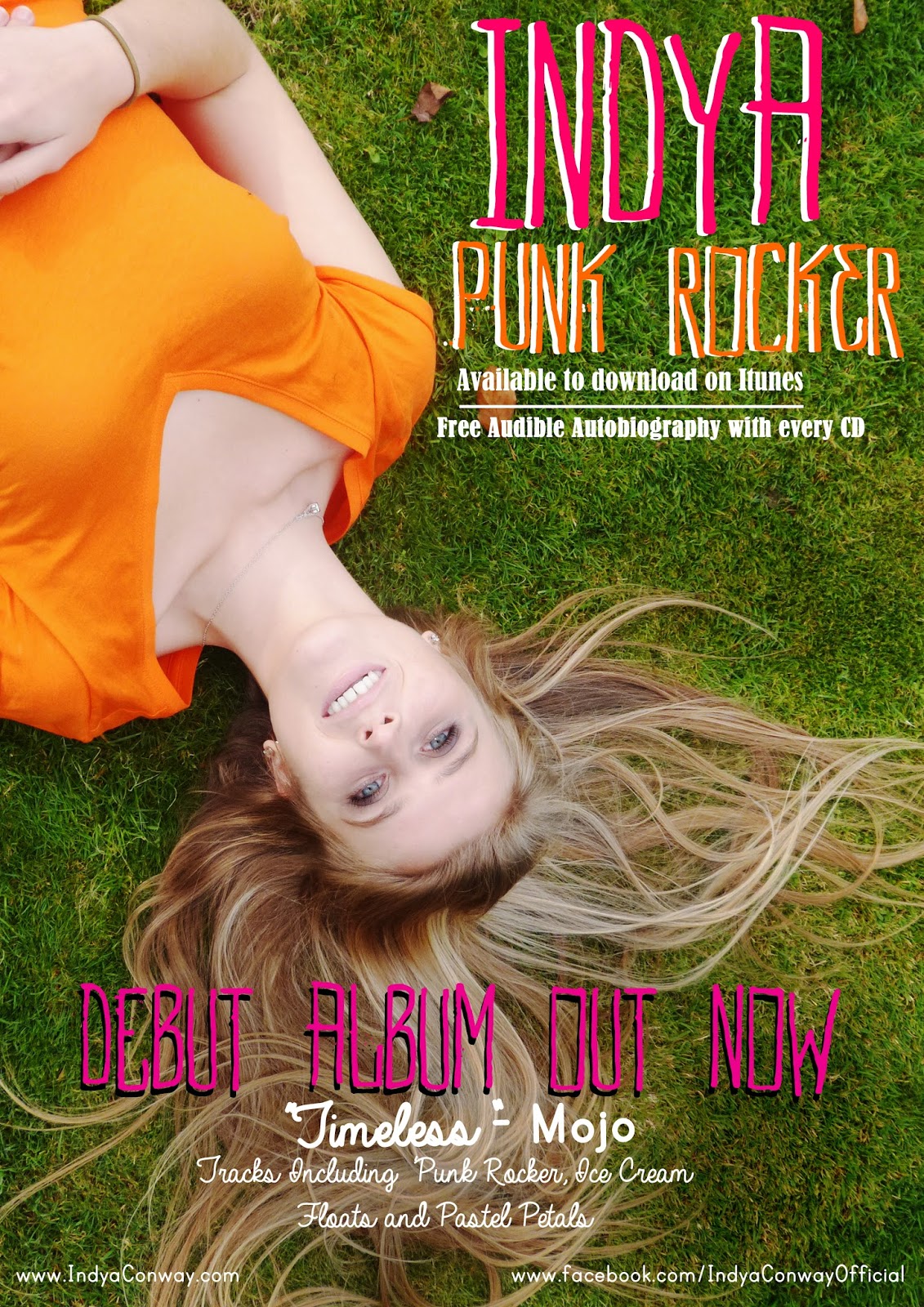
An initial way that we intended to create synergy between our products (music video and digipak) was that we used the same image of flowers used in the vignette mask in the music video whilst also using this as the background of most pages of the digipak. Our early thoughts for the digipak was; to have a colourful background or an image for the background although, we also wanted a background that would make the text standout as it is a vital tool for engagement with the audience. Using Adobe Photoshop we split up the existing floral image and separated certain flowers that looked particularly bright and clear, we then created a repeating pattern. Another aspect of the background was, our intention to adhere to the convention of vibrant explosive colours to ultimately appeal to our target audience. Due to the nature of our chosen song we chose to use stereotypically feminine colours- the most recurring colours include orange and pink which were filtered throughout the music video. Further driving our easily identifiable synergetic compound of products.
 Colours of texts we used was something else we considered when constructing our products especially our digipak and our music magazine advert. Using the colour wand tool


I also created synergy with our stars clothing (Indya), during the music video Indya was shown wearing a bright orange t-shirt, I then used this colour as within the magazine advert and the digipak. The orange used was due to the fact it is vibrant and has positive denotations for our star image- it has upbeat and happy connotations that can be linked with the music video.


In our products we also made sure to illustrate Indya wearing a variety of clothing used across the entire video, this essentially displayed Indya's entire star image. The clothing Indya used was all her own cothing as it expressed a very authentic and naturalistic star image. We also used casual clothing because it meant that Indya's potential fans could easily emulate her bright and casual clothing style. Due to the fact it is easy to replicate these clothes.


 Across all of our products, I chose to use similar fonts, within the music video our font for the title of the song was handwritten. So we searched for a font that looked similar. So we went on onto 1001 free fonts. The font then became the main font used across all of the products.
 In our media products we intended to create synergy across all of our brand and promote our artist at the same time. This is the reason that we put tour dates on our digipak for both our music magazine advert and the digipak. Even though the fonts do not match, we chose to use instructional detail and the tour dates that was on the digipak had to be matched onto the advertisement- this made it seem more authentic and professional.

Our main use of synergy was the association of images, we used the same image for the album cover as the magazine advertisement. Both images were kept fairly lain as this meets moder conventions. The same image was used as it denoted the artist in a fun and creative light, whilst also creating a simple link between the artist and the digipak.
Additional promtional media
Even when creating additional media products that were not in the brief, we intended to keep the synergy between our products. Even though it was not apart of the brief, we felt that this really emphasised our brand image. I wanted to create a promotional piece that could appeal our major target audience, this is due to our audience being mainly teenagers.


Tuesday 9 February 2016
Monday 8 February 2016
Q4 - How did you use media technologies in the construction and research, planning and evaluation stages?
Thing-link: Final Cut Pro X breakdown

Construction of our vignette mask on Final Cut Pro X
- In order to incorporate the vignette mask into our music video I had to first open up our project on Final Cut Pro X.

- I then worked with my partner to find the clip that would be used for the vignette mask, we chose to use the backwards tracking shot of Indya and the group of friends following her. Then scroll across two the effects which is in the bottom hand right corner, this features lots of effects to use.

- Then to find the vignette tool we had to use the search bar (at the bottom right) on effects. Where we found the vignette tool, when hovering the mouse over the tool it gives you a preview of the effect. This was quite easy to do and i liked the way the effect can easily be applied to the timeline and then the controls appeared instantly in the viewer. In this way this software was easier to use than Elements 11 in AS, I was pleased with the speed with which i could alter a shot.

- Then we added the effect, as you can see the vignette mask goes onto the time line over the clip, the vignette mask is only slightly darker around the edges and doesn't have an image over it yet, but this will be added afterwards.


- As we wanted a stronger effect onto the underlaying image we upped the blur amount to 2.0 this was the reason of having a thicker vignette mask; so it is more notable. In retrospect i think we could have altered this depending on when we repeated this shot as a softer approach may have changed the connotations.

- We then added the vignette mask tool to the clip, we upped the blur amount, and increased the size of the vignette mask. This was the result of our changes to the mask. The black is where the image will be overlaid. This can be quite challenging, I worked on this for quite some time as when it was too small and Indya moved, we lost her centre frame importance. If it was too large we lost some or most of the flowers. I am pleased with the end result.

- This is the image we chose to use for the vignette mask overlay, we figured it is bright and links into lyrics of the song.


- We then added in an earlier shot we took of flowers in Emily's my garden, we particularly wanted to use this vignette mask as it is an unconventional aspect of our video.

- We then made this shot into a freeze frame as when I replayed the clip there was a slight movement from the camera, by adding a freeze frame we was able to make a still of the shot. We then put the shot of the flowers underneath the timeline of the reverse tracking shot, which allowed the software to cover the black and use the flowers.

- This is the completed shot of the vignette mask used. We feel this worked particularly well as a result, as it enraptured the main lyrics into an unconventional key effect.
I feel the vignette mask was a complete success as it had a professional look gave a clear link between the aural and visual representation, this obvious link further widen our potential target audience as a bigger more mass audience could identify these media techniques. The vignette mask develops thoughts and connotations; this idea first came about when we were brainstorming potential ways in order have lyrics match the visual- the flowers are obviously a key element/symbolic sign [Barthes] for the message of the song. The vignette mask worked as a perfect tool for implementing this in our video. In retrospect, instead of using the same image of flowers twice for the vignette, we could have had another colour that would further push some other indexical symbolic messaging. This would have been achieved by possibly having bright yellow flowers that could establish this sense of warning to the audience- that this potential life path will not be good for her. I am pleased overall with the effect of the vignette however, it could have had a wider spotlight and I could have further altered the blur and size to blend the colours together more fully. One excellent result of this editing technique was that it allowed me to create a still image for the digipak thus developing synergy.

We were met with this message on our mac and after countless efforts to re-upload the footage or trying different macs, all attempts at recovering the work failed. The result was that one of the memory cards was wiped. Thankfully we still had the other footage of that day, but ultimately we were put on the back-foot from day one. This meant that we needed many more shoots to make up for this disaster. In reflection, I feel this fuelled us to strive harder and put more effort into the project to make up the time. It also enabled us and empowered us to reconsider the sequences taken at the shoot and despite losing footage the new shots were even better. I feel we handled this set back brilliantly as we created a music video that still captured our main intention.
Bloopers/out takes
Technological disaster
After a weekend of filming we came back with our two memory cards of footage, whilst uploading them to the mac- the disaster happened.

Bloopers/out takes
Me and my partner created a blooper and out-takes as it highlights our selection and rejection responsibility when editing together our music video.
Bloopers
I believe that this blooper reel expressed how we were very postmodern in the way we created this music video. I was extremely aware of the presence of the camera and the connotations that I could create via media language. I feel this bloopers shows how our creativity was pushed and we were driven to attempt a range of different shots. Some worked well and some didn't. Many shots had to be retaken, not only because of character issues but also due to the weather and at one time lost footage during an upload. Upon reflection I think these out-takes portray development in skills, as it illustrates how difficult some shots tended to be with all the actors/props involved. This in comparison to AS, when we simply had a still image with a model and some props, was a lot more difficult to direct and organise. I feel my skills have developed enormously during this course and that I have a much greater understanding of the importance of pre-production paperwork and preparation as without the shot lists, production breakdowns and storyboards I would have found this production much more difficult.
Prezi and the Research, planning and evaluation stage
I also used Prezi to present product research, this allowed me to create more visually pleasing representations of information, with the use of images, screen captures and videos as well as text to give a more well rounded display of information. By using a small amount of text with the addition of an image with a video as well boosts the level of information that you receive as it isn't just a block of text- in a way you could argue it is rectifying you point more clearly with additional forms of media to get your point across. In AS, I barely used prezi and when I did it was more of an essay in bubbles; I do feel my skills have developed with online software. I have also used prezi in this evaluation in order to organise my response.
Research: Scanned word docs, Celtx - analysis of ancillary products: digipaks, embedded ppt eg Pink, Prezi eg Postmodernism - Jessie J, annotated images. Google and youtube was the most important technology in this phase. I used this to research existing products as they were vital to my understanding of conventions.
Youtube - embedded video was used for research. I enjoyed this, it was useful however, again i found pause and screen capture enabled me to write far more analytically about each shot. This was also more useful as then I had a better idea about the shot type I wanted in my MV.
Planning: For most of the production planning, paper sources were used eg: call sheets, risk assessments, script breakdown, production breakdown, storyboards.
These were all found in the lessons folder on the mac and I was able to upload these, alter them, print and save to numerous files.
CeltX online and installed on our macs was useful at all stages. I found this very easy to use and it was clear.
Powtoon- rough cut of one shot and TA profiling. This was very useful and gave me an idea of the video so far. I was also able to conduct further TA research and ask a focus group for feedback.
 When planning the logo and design I enjoyed using Slidely, Beautiful Photo galleries, this gave me an idea of visual appeal and synergy for the promotional value of the package. This was also a very useful tool for principle photography. It enabled me to view the locations and again develop a sense of the visual appeal.

Social media was also useful. My partner Emily was able to use her Facebook page to conduct TA research. We both benefitted from this greatly.
Snapchat also enabled us to begin to develop word of mouth and interest in our production.
Planning leading to construction - rough cuts exported from Final Cut Pro X. These were incredibly valuable as I could watch it through and i could also conduct further TA research.
Evaluation: Prezi, text and cut aways. Thing-link was easy to use and I now wish i had used this much earlier. It's a great way of annotating a still image or screen capture.
Preferred style: I believe that my preferred style is mainly taking a still image and analytically picking out media techniques and theories. Although I am highly capable of using a variety of technological tools such as; prezi, powtoon and thinglink, I strongly feel my best work and most helpful for my own understanding comes from strongly breaking down an image to reveal all of its meanings.
Sunday 10 January 2016
Saturday 9 January 2016

Friday 8 January 2016
Thursday 7 January 2016

Wednesday 6 January 2016
Tuesday 5 January 2016


Monday 4 January 2016
Planning: Indya- Punk Rocker Music video Target Audience Feedback- Questionnaire 5
Questionnaire Feedback
Did you like the locations used within the music video?
I think there was a nice range of locations that linked really well with Indya's star image
Do you think that we met our target audience (13-17)?
Yes, the use of colors and extras worked within the video, really linked with the TA
Do you believe that Indya was a convincing star?
Yes, she suited the song well
In your opinion do you think we used enough shots? why?
Yes there is a nice range of shots with various locations, although performance could get repetitive
What was your favorite shot of the music video? why?
the last shot with the balloons was a really nice ending to the video, I also liked the time lapse
Which transition did you prefer? cuts or blurs?
I liked the combination of the 2
Did you understand the concept of our video?
Yes, expressing feelings towards what she wants to be
Was the makeup effective throughout the piece?
Yes
Planning: Indya- Punk Rocker Music video Target Audience Feedback- Questionnaire 4
Questionnaire Feedback
Did you like the locations within the music video?
Suited star- not sure about boats ?! low angle shot (box in background) implies shes not strong enough to rebel
Do you think that we met our target audience (13-17)?
Yes- Possibly older too as some older TA may recall the era
Do you believe that Indya was a convincing star image?
Yes- well synced, She seemed very happy and positive connotations were created
In your opinion did we use enough shots? Why?
Yes, one shot seemed a little long, intertextuality with archive footage is interesting
What was your favorite shot in the music video? why?
Tracking back as Indya led the group forward, photo into action, brick arch frame
Which transition did you prefer? Cuts or blurs?
Faster cuts yet the blurs/ cross dissolves work well in the slower shots
Did you understand the concept of our music video?
Desire/ nostalgia for a period long gone
Was the makeup effective throughout the piece?
Innocent- white shirt/ scarf work well with the natural environment, black jacket which was the punk rocker, the development of makeup works
Planning: Indya- Punk Rocker Music video Target Audience Feedback- Questionnaire 3
Questionnaire Feedback
Did you like the locations within the music video?
The locations were well used and I liked them
Do you think that we met our target audience (13-17)?
The target audience was well met
Do you believe that Indya was a convincing star?
Yes, she looks like a good performer
In your opinion do you think we used enough shots? why?
There was a wide range of shots and they were all effective
What was your favorite shot of the music video? why?
At the start next to the bush and she walks past
Which transition did you prefer? blurs or cuts?
Cuts, but the blurs worked well when the song was slower
Was the makeup effective throughout the piece?
Yes, there was nothing over the top
Subscribe to:
Posts (Atom)